Yes! Pantone finally announced the new ‘Color of the Year 2021’ or ‘Colors of the Year’ actually. A tradition that Pantone started in the year 2000 when the choice was Cerulean Blue 15-4020. For 2021 they’ve chosen Illuminating Yellow 13-0647 and Ultimate Gray 17-5104.
At first I wasn’t trilled. The first image I saw was a graphic of the color combination only and I thought bleh! But looking at the colors separately and seeing other images (real photo’s) convinced me that I judged too soon. I actually love these colors. The yellow is almost the same as the yellow I use for LemonPattern and I have always been a big fan of gray (you should see the pile of gray sweaters I have).
Gray with its neutral character is also a color that brings out the best in other colors, it accentuates the hues and gives the colors a stage to shine. Where black is too high and hard in contrast and white is too bright, gray is the perfect partner. Yellow is the most visible and luminous color of the spectrum. The human eye processes yellow first and the peripheral vision is 2.5 times higher for yellow than for red.
I recently discovered -while looking at my designs of this past year- that I started to use a lot of yellow. Were it used to be blue and orange and even bright pink, yellow seems to be my go-to color at the moment. For me yellow means happiness, courage, show up and shine!
No one ever injured their eyesight by looking on the bright side.
Unknown
Pantone writes on their website: “PANTONE 17-5104 Ultimate Gray + PANTONE 13-0647 Illuminating, two independent colors that highlight how different elements come together to support one another, best express the mood for Pantone Color of the Year 2021. Practical and rock solid but at the same time warming and optimistic, the union of PANTONE 17-5104 Ultimate Gray + PANTONE 13-0647 Illuminating is one of strength and positivity. It is a story of color that encapsulates deeper feelings of thoughtfulness with the promise of something sunny and friendly.”
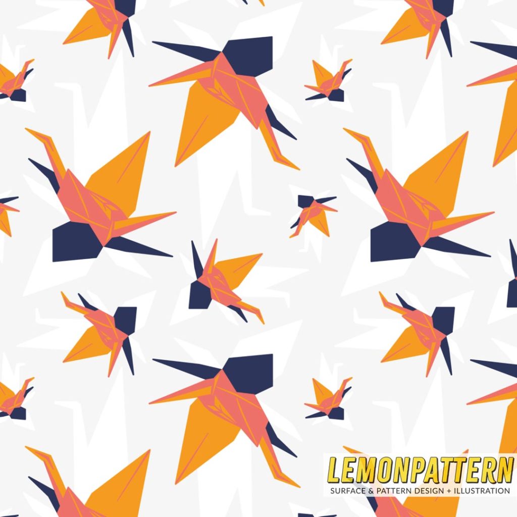
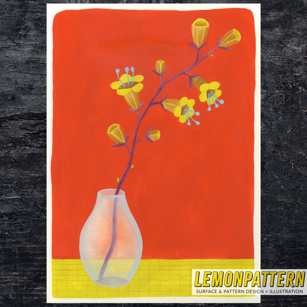
The color palette used in my ‘Paper Crane’ collection is Pantone’s Color of the Year 2019: Living Coral. A very personal collection with lots of meaning and emotional layers. My new collection (yet to be designed) will be inspired by the Color of the Year 2021 and my ‘Vermilion Still Life’ painting. Keep your eye out for that one 🙂